I was excited to try my hand at maps, surveys and timelines because I am a junkie for data visualization. Give me a clean and clear chart or graph any day. Make it interactive? Even better.
Of course, I understand that the interactive data visualizations I see on professional media are created by talented, experienced pros, but it was great to learn about the free programs that can help us newbies get our feet wet and make share-worthy, publishable graphics. They are definitely easy enough for scholastic journalists to use as a jumping off point, too.
First I tackled the map portion of this assignment. After exploring multiple options, I decided to go with Google Maps because it’s what my students are most likely to use.
Our publication often runs restaurant reviews, and I think it would be great if they start creating maps to show the locations of places they review. Mapping could also lead to coverage. I’m imagining they may look into where various types of restaurants, stores and services are, create a map showing their locations (for example, where the nail salons are, which would be especially relevant before an event like prom) and then write mini-reviews of each of the locations they map.
With this idea in mind, I created a Google Map (see below) of coffee shops in our high school’s town, Northborough, Mass. After determining the locations I would map, I headed out to take photographs, keeping in mind I wanted each image to be similar, clearly showing the front of the shop, but not exactly the same, so I slightly varied the angles I shot from.
After collecting my data, the Google Maps interface was easy to use. After inputting the addresses and uploading my photos, I played around with changing map colors and marker styles to best suit my task.
While of course the publication I advise could simply run the map along with online reviews, I can also see mini-reviews being embedded right into the map or perhaps converting the map into a ThingLink with hot-spots where mini-reviews pop up.
Next up was my survey. I originally planned to create a survey to administer to school community members for feedback on our publication’s website. I had begun to draft questions and was pondering whether to include screenshots of various parts of the site in the survey.
However, quickly coronavirus precautions amped up and I found myself out of school for at least three weeks, so I decided change my survey to one for the wider public in connection with what’s on everyone’s minds: COVID-19.
Over the last few days, as we’ve been bombarded with news and worry, I realized people might actually want to share how the new coronavirus has impacted them. As an interactive experience, a survey not only collects data but also provides respondents with a voice. While my survey is on the topic everyone can’t escape, I wanted its focus to be one that helped people feel a little better by acknowledging and collecting data on personal impact.
I chose to use Google Forms, again because it is the mode most likely to be used by my scholastic journalists. I came up with five questions that utilized three different question forms (multiple choice, check boxes and range) so I could practice writing those formats and see how Google provided data visualizations for various question styles.
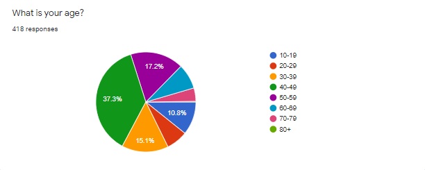
While writing the questions, I thought it was important to begin with demographics. For this brief survey I wanted to have only one such question and decided the most important demographic when it came to the impact of coronavirus is age.
I initially was going to provide only a few answer choices to group those under 20, those 21-59 and those 60+ together to represent potentially different risk and impact levels. However, I looked into how other media were covering the virus and referring to age groups in their data visualizations and chose to break the age demographics by decade so I could have more fine-tuned data. I also thought it could be odd for a respondent to see uneven age groups and wonder if I had a bias or agenda going in.
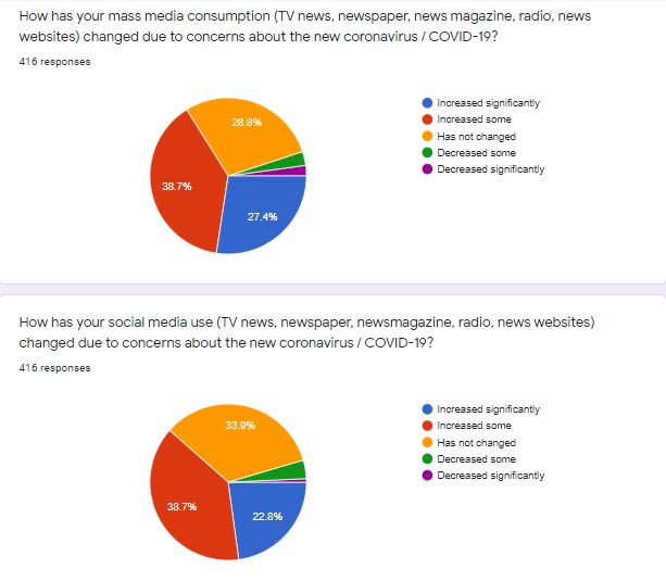
When it came to writing the other questions, I decided to look at how the new coronavirus has impacted daily life and future plans, attention to mass media, use of social media and general worry about contracting COVID-19. I took time to brainstorm and think about potential experiences other than my own while drafting answer choices.
I also did a lot of revising and rephrasing, with attention to clarity and consistency of wording. I wanted to make sure questions were not leading and the answer choices were not biased in their phrasing.
Once the five-question survey was done, I shared it in a few ways: through Twitter, on Facebook and by posting it as an announcement to my high school classes. I encouraged people to share the survey with others. I was really excited to see my original tweet re-tweeted by a woman in England, Deborah A Stansil, who has over 13,000 followers. I used the hashtags #poll and #coronavirus. I guess the hashtags worked!
I re-tweeted and reposted a few times, and I really enjoyed seeing the responses come in. As I write this blog five days after releasing my survey, I have 418 responses and they keep coming in.
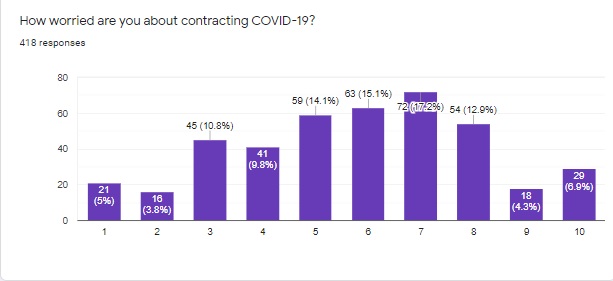
The data is fascinating and I’m including the current results here.
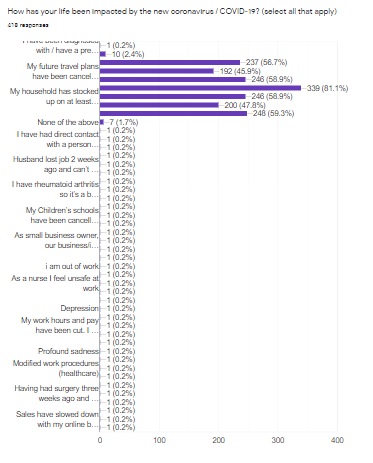
Because there were so many choices along with an “other” choice for question two, “How has your life been impacted by the new coronavirus / COVID-19?” the data is more difficult to share and analyze.
I don’t think there would be a different way to phrase this question, but if I were using the data to inform reporting, it would definitely take me a while to go through this part of the spreadsheet. It would also be necessary, especially for this question, to create my own graphic and not use the one generated by Google because it is impossible to read.
Multiple choice and range questions such as the age demographics above and the three questions below resulted in clean, clear graphics.
In terms of students, a survey like this is an excellent way to represent student voices and generate localized data to include in reporting. I think these types of surveys can also generate story ideas and help find sources by allowing respondents to leave contact information if they wish to be interviewed.
Once we’re back in school, I plan to have my editors create a survey like the one I originally imagined so we can get some user feedback on our website’s design and content. I’m hopeful the survey I’ve conducted will also inspire my staff to create their own COVID-19 impact survey as they work from home.
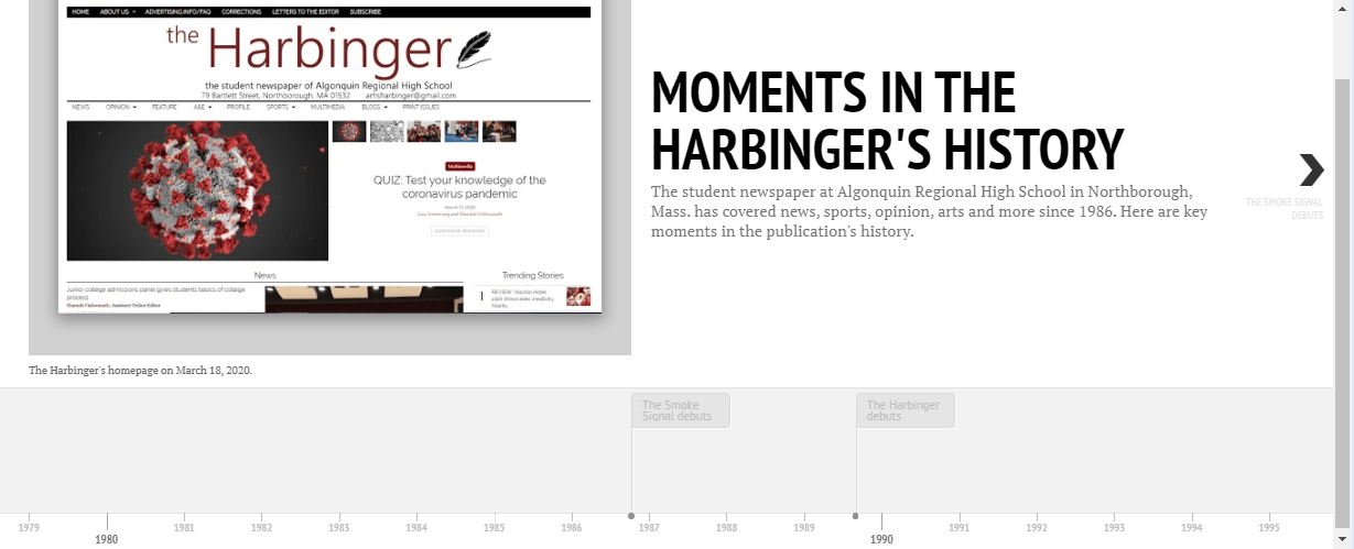
Finally I tackled making a timeline, which proved to be the most time consuming of the tasks, but it was rewarding to see it come to fruition. I decided to create a timeline of some key moments in the history of the paper I advise, The Harbinger.
After studying various timeline generators, I chose to work with Timeline JS because the examples they provided were engaging and professional. I also appreciate that it is free with a lot of tutorials and resources.
I began by identifying points in history, collecting all my data, writing blurbs and taking pictures and screen shots I planned to use to illustrate the timeline. While doing so I learned how to find old Tweets from pretty much any account which I think could be useful to my student journalists. You simply go to twitter.com/search-advanced and enter the username under “From these accounts” under “People.” You can then select date ranges or key words.
I watched the site’s simple tutorial video and copied the Google spreadsheet they provided. I decided to upload the photos I took to my Google Drive and made sure that they were “public” before I put the image links on my timeline.
When I was all done inputting my data, I crossed my fingers, hit preview and it worked! Here’s the link to the timeline.
I’m really proud of how professional the timeline looks, although I do wish I were able to shoot the newspaper images somewhere other than my dining room floor, but it has the best lighting in the house I’m basically confined to due to COVID-19 precautions.
I’ve already shared the timeline via link and embed code with members of my newspaper staff, hoping it inspires their own work and teaches them about the history of their publication. These projects have been really fun to work on, and I’m excited to share these skills with my staff!
